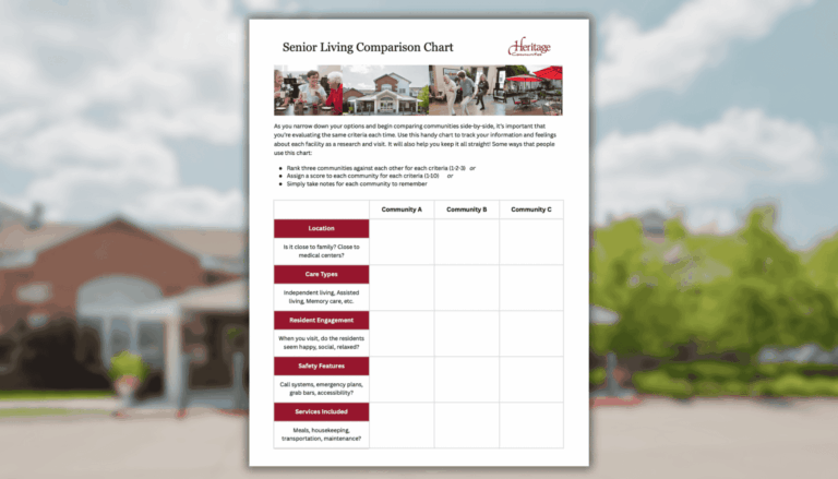
A Simple Senior Living Comparison Chart
Maybe you’ve visited a few communities, gathered brochures, or taken a tour or two. Even with great amenities and caring staff, it’s still hard to know which place is the right fit. That’s where our Senior Living Comparison Chart comes in.
If you’re here, it probably means you’re in the middle of a tough decision. Researching care, juggling responsibilities, and trying to do what’s best for someone you love… it’s a lot! And it’s okay to feel overwhelmed. Just by reading this, you’re already making thoughtful moves forward. If a Heritage Community is one of the places you’re considering, we’re grateful to be part of your journey.
Maybe you’ve visited a few communities, gathered brochures, or taken a tour or two. Even with great amenities and caring staff, it’s still hard to know which place is the right fit. That’s where our Senior Living Comparison Chart comes in. It’s a small tool that can bring big clarity.
Why the Chart Helps
This chart isn’t just about comparing facts. It’s designed to help you track what matters most to you and your loved one. You can bring it with you on tours, jot down notes, and use it to sort through what you’ve seen.
Use it your way:
- Rank each place in each category
- Score them from 1 to 10
- Or just write down what stood out during your visit

What to Look For in a Senior Living Community
We built the chart to guide you through the big stuff and the little things, because both matter:
- Is it close enough for regular visits and nearby doctors?
- Do residents seem happy and engaged?
- What services are included—and what’s extra?
- And how does it feel when you walk in?
We’ve also included a pricing breakdown, so you can see the difference between all-inclusive, tiered, or à la carte models. No surprises, just clarity: because budgeting shouldn’t be confusing.
Bring the Senior Living Comparison Chart With You!
This isn’t just a checklist. It’s a tool to help you feel grounded in your decision. Whether you’re visiting Heritage Communities or looking elsewhere, the Senior Living Comparison Chart can help you stay organized and focused.
If you live in Nebraska, Iowa, Arizona, or Texas, one of our communities may be nearby! Bring this chart on a tour with us and we’ll walk through it together and help answer any questions.
Recent Articles

The Invisible Load… and Why Most Family Caregivers Don’t Stop to See What They’re Carrying
Download our free guide "The Invisible Load" to understand and take stock of the caregiving weight you're carrying. It might help you understand what to do next.
6 Minute Read
The Benefits of Community Life: Why Senior Living Can Enrich the Years Ahead
The holidays remind us how good it feels to gather… to share meals, stories, and simple moments. But for many older adults, those moments become less common over time. As friends move away, routines change, and daily tasks get harder, it’s easy for life to feel quiet and isolating. At Heritage Communities, we believe there’s...
4 Minute Read
How to Celebrate the Holidays With Someone in Senior Living
If you’re starting to consider senior living for a parent, the timing may feel complicated… especially around the holidays. You might wonder: Will the season still feel special? Will we still celebrate the way we always have? Will Mom feel left out? We understand those worries. They’re natural, and they come from love. What we...
6 Minute Read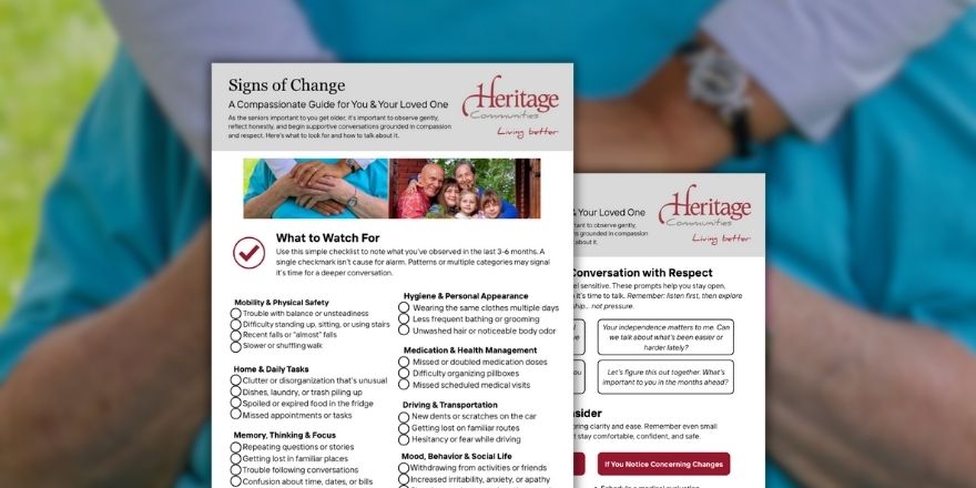
When You Suspect Something’s Changing: A Compassionate Guide for You and Your Parent
If you’re noticing small shifts in your parent’s health, memory, or daily routines, you might be wondering whether you’re overthinking things… or if something really is changing. Download the free PDF checklist to help!
5 Minute Read
Ringing in the Season: Spotlight on Our Bell Choir at Heritage Communities
The holidays are a busy, fun time in senior living! Across our communities, families and groups are getting ready to celebrate with their families and their Heritage family. We’re glad to share a story from Orchard Pointe at Terrazza (a Heritage Community) that really shows what Living Better together looks like. It’s about the wonderful...
4 Minute Read
Does AI Replace Caregivers? The Truth About Technology in Memory Care
In senior living, new AI technology helps caregivers... it doesn't replace them. By handling background monitoring and alerting, AUGi allows caregivers to spend more time where it matters most: engaging with residents, offering comfort, and providing personalized care.
4 Minute Read